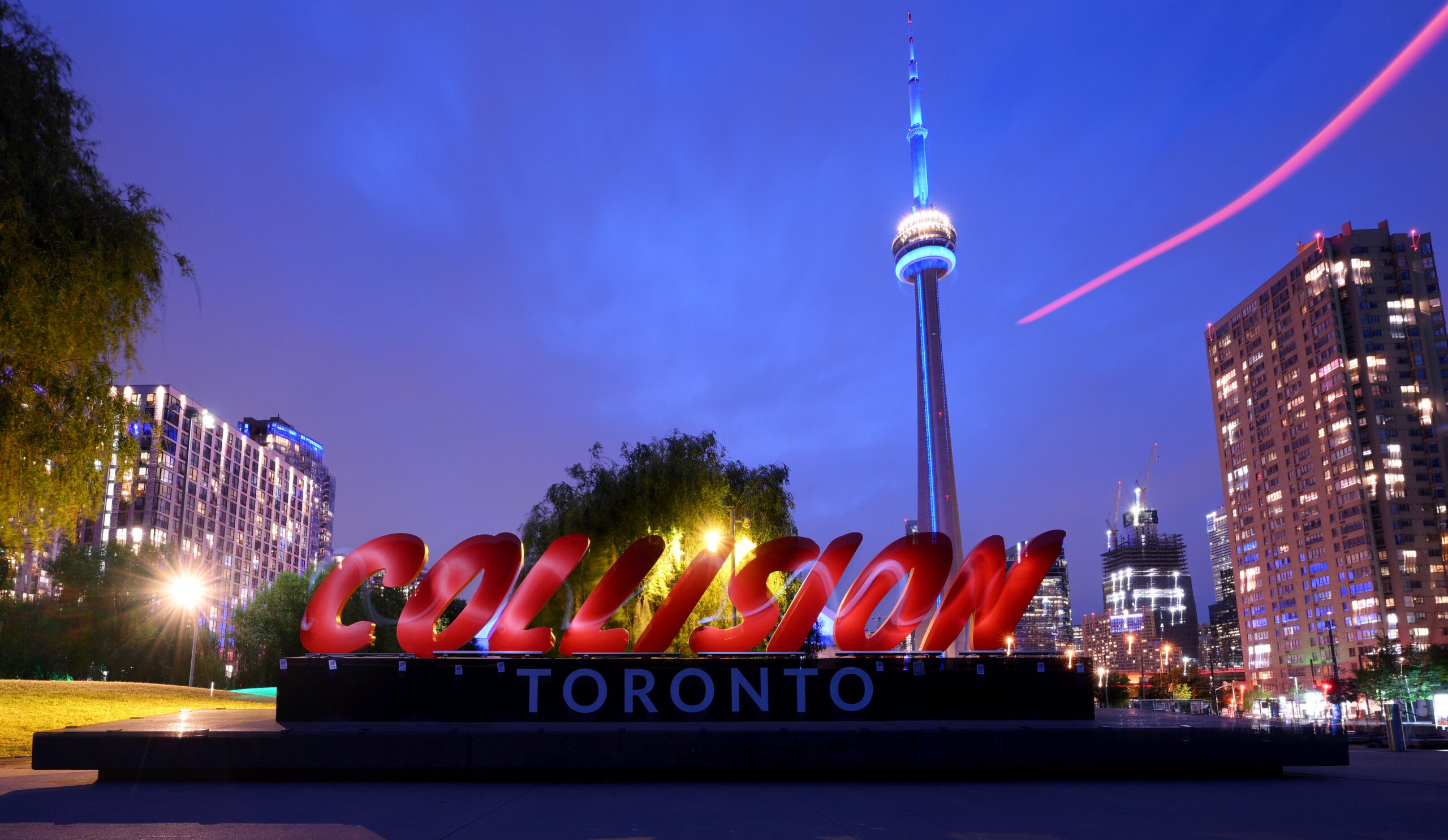
A bold evolution for Collision, the conference that challenges expectations.

Between the second half of 2020 and early 2021, I led the brand refresh strategy and design for Collision: the fastest-growing tech event in North America. I worked closely with a talented team to refresh Collision’s visual identity—injecting it with a sense of daring and boldness that better matched the fast-paced, ideas-driven world it represents.
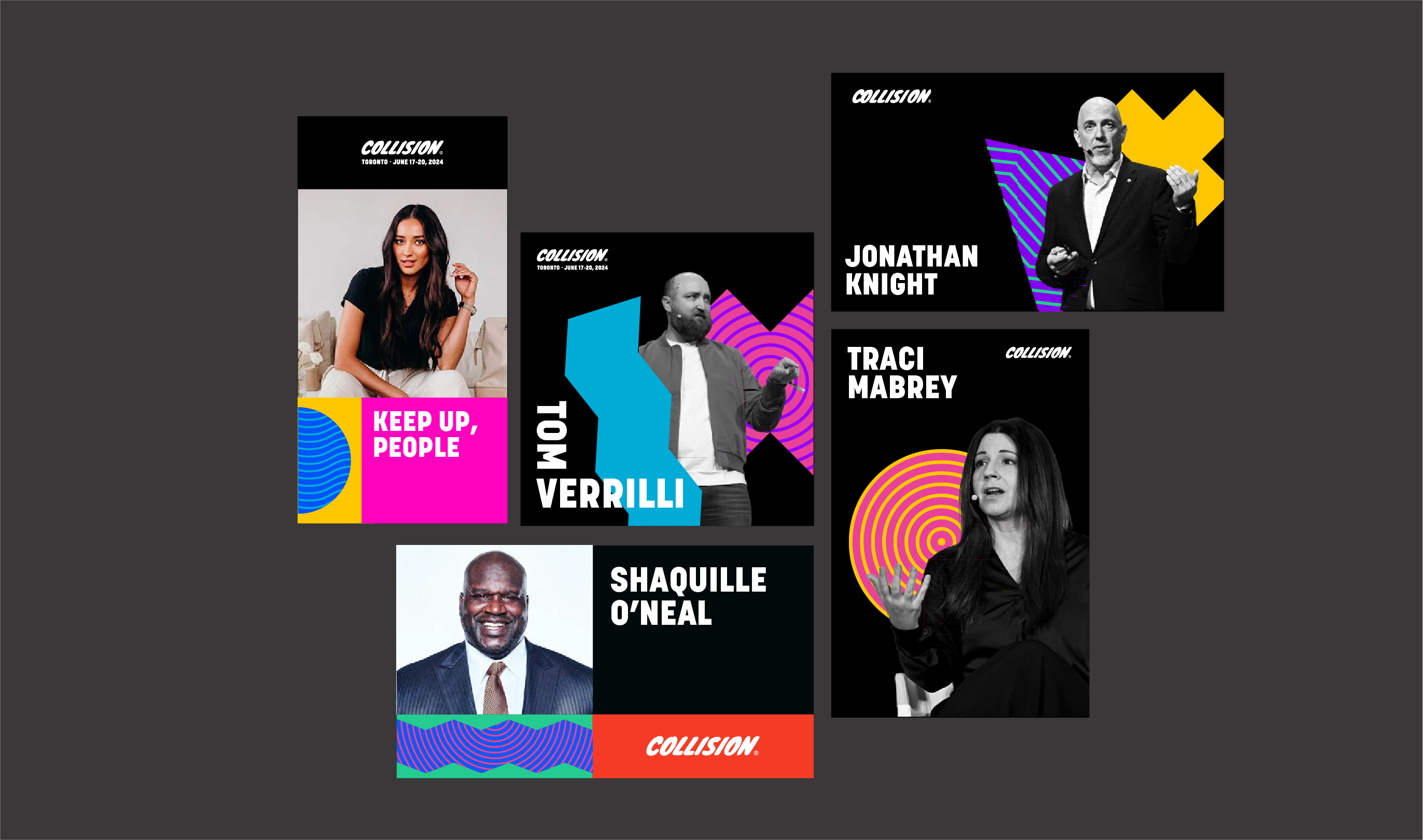
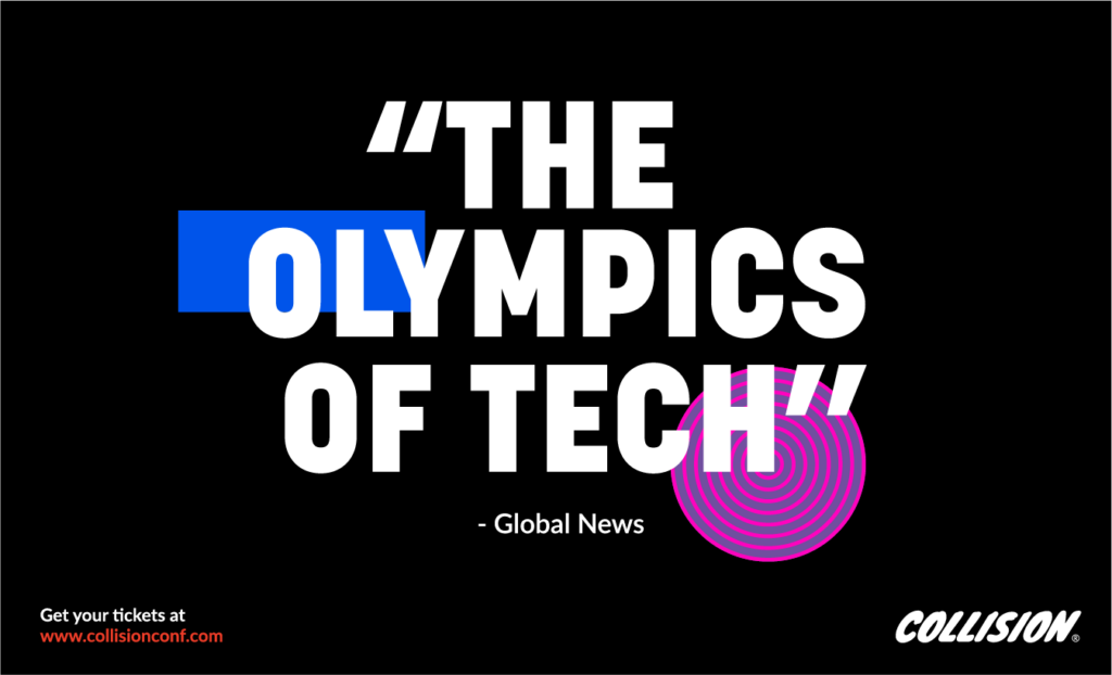
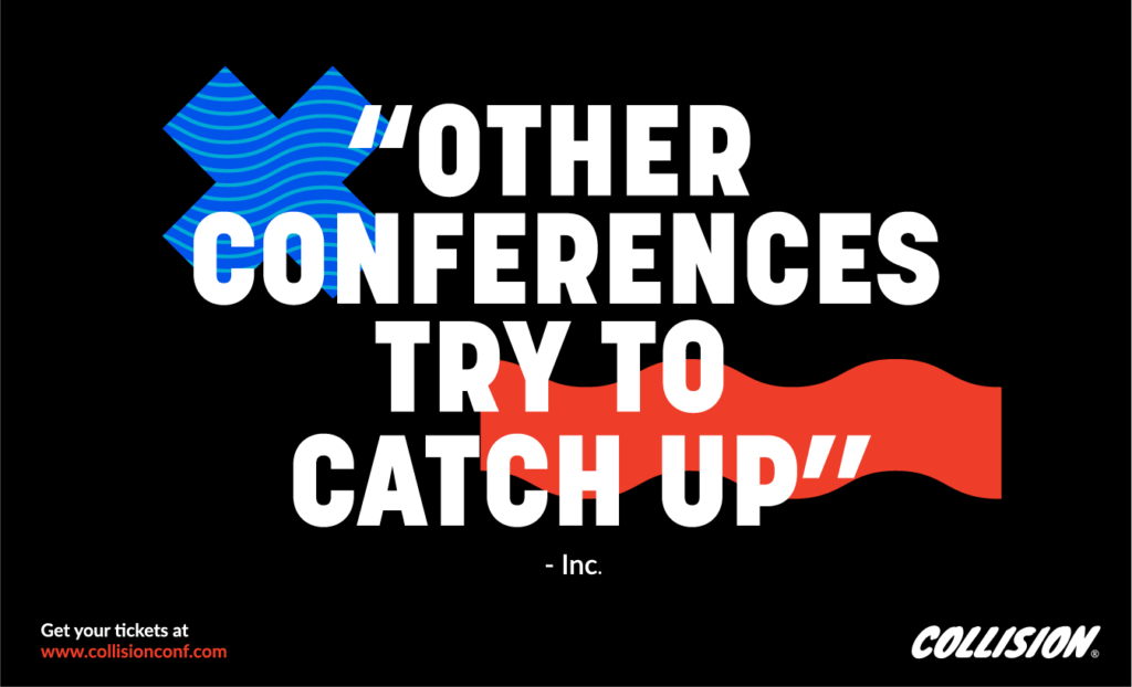
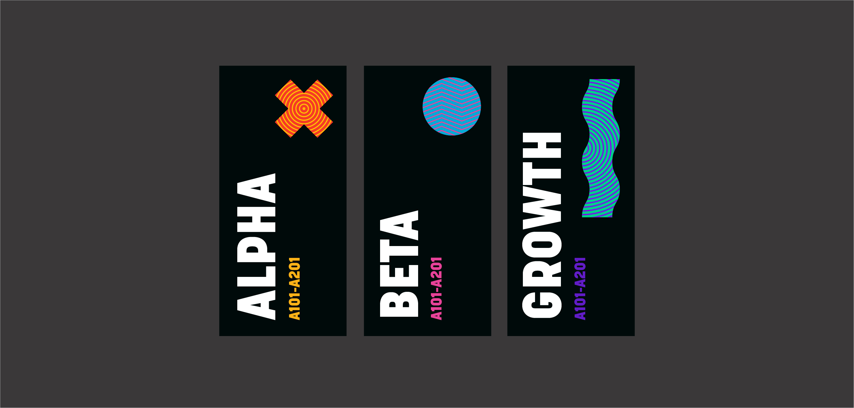
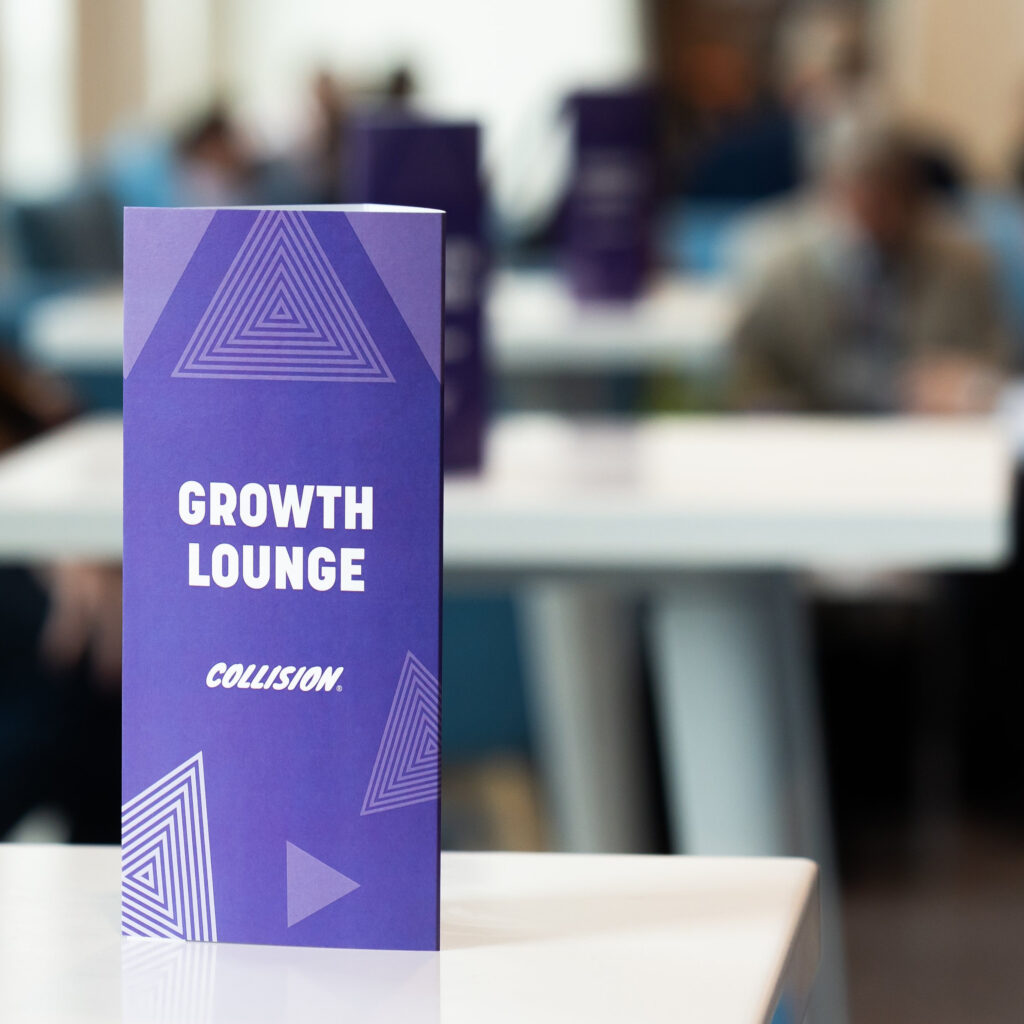
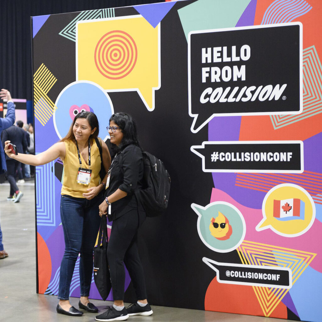
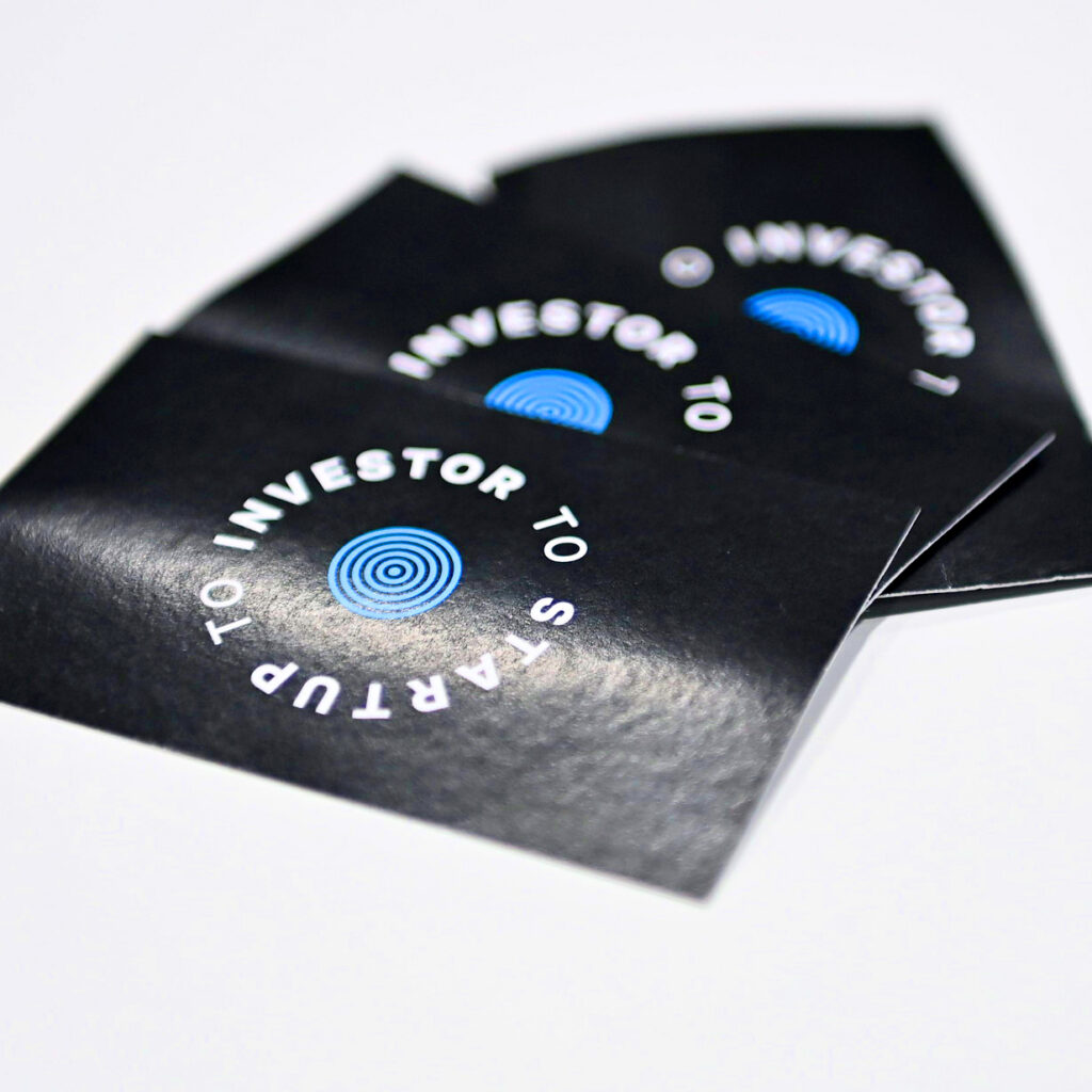
We worked first on the brand’s foundation and personality, which we translated into its visual identity and tone of voice. We upgraded the logo, and introduced high-contrast colour combinations, vibrant graphic patterns, and a confident tone of voice that pushed the brand into new territory while staying rooted in its core.
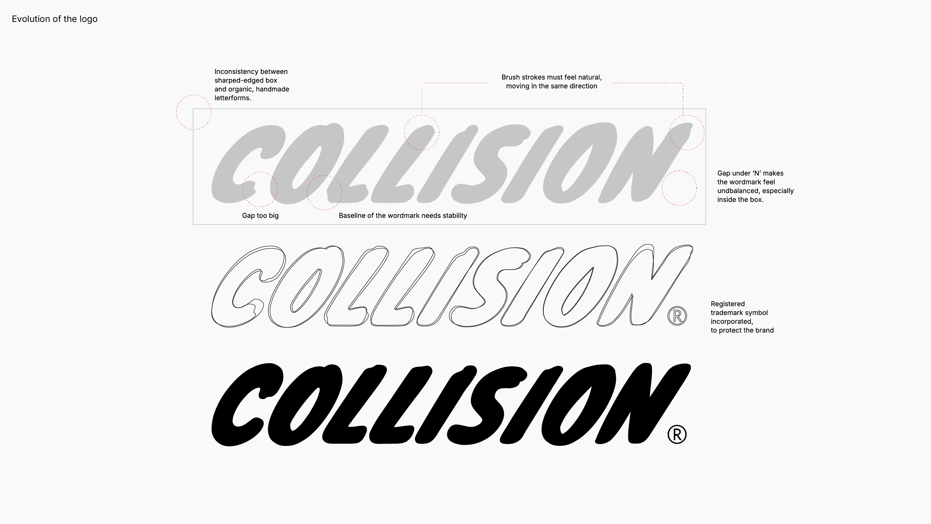
Evolving the logo
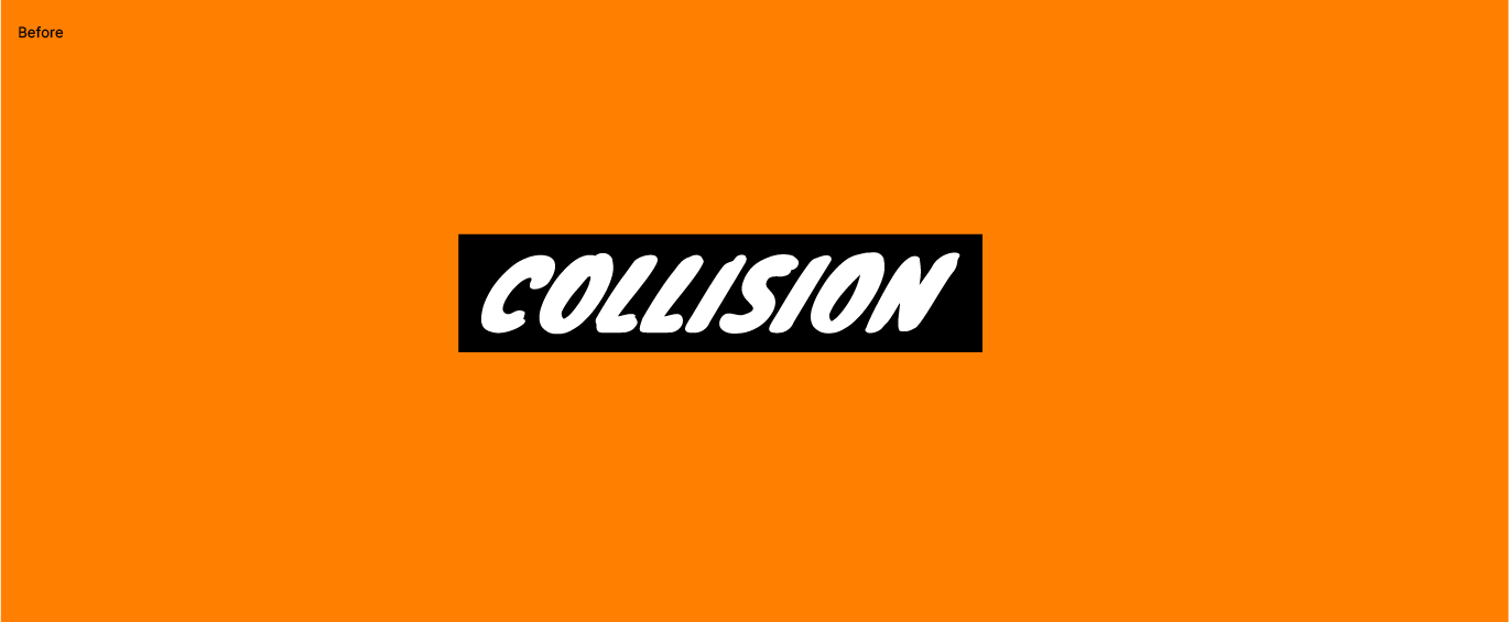
The original Collision wordmark had a distinctly handmade feel, but lacked harmony and balance. The rigid black box clashed with the organic brushstroke lettering, creating visual tension. Uneven spacing, inconsistent stroke movement, and a floating baseline all contributed to a wordmark that felt unstable—especially when scaled or framed within brand materials.
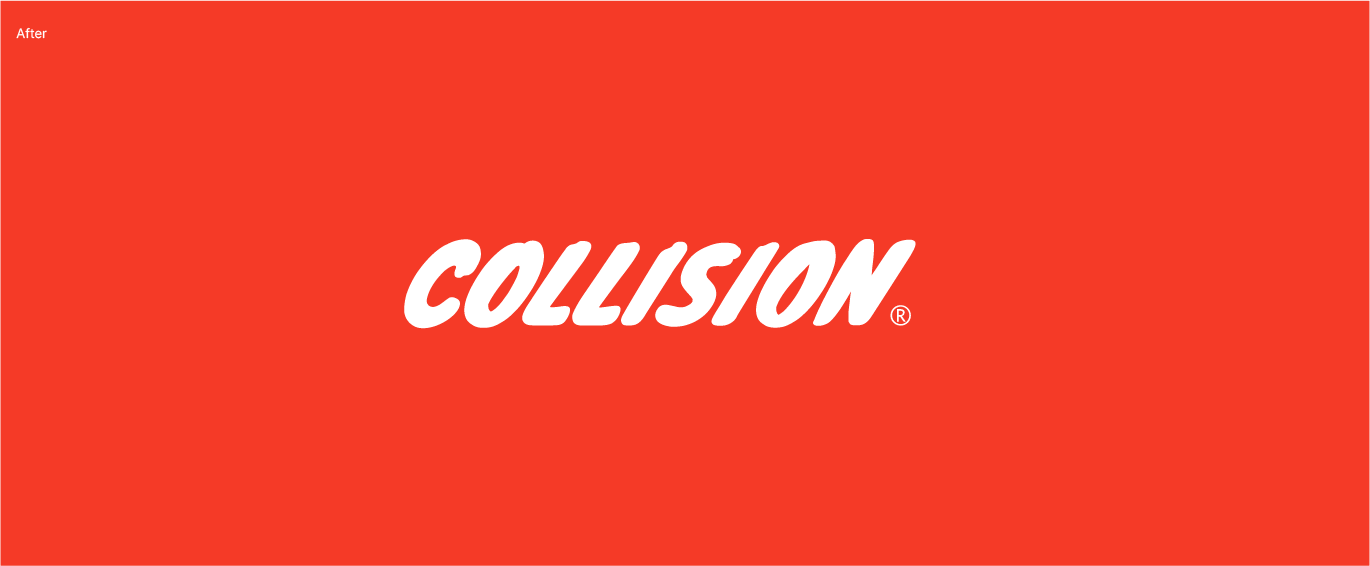
In the updated version, we refined the structure while preserving the energy of the original. Brushstrokes now flow naturally in a unified direction, gaps were tightened for balance, and the baseline was anchored to improve legibility. We removed the black box entirely, allowing the wordmark to breathe on bold backgrounds. The result is a cleaner, stronger identity—one that’s more confident, scalable, and unmistakably Collision.
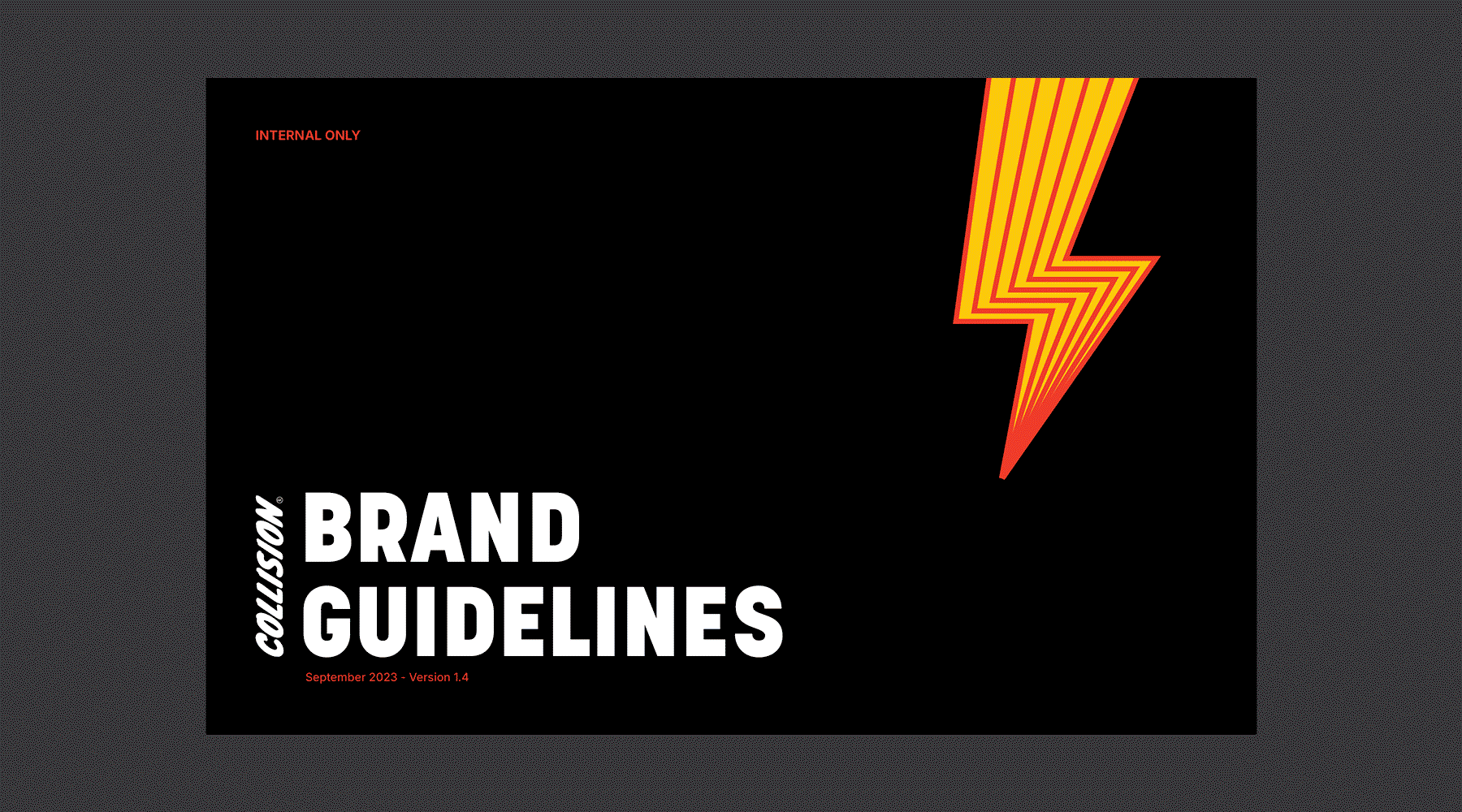
Comprehensive brand guidelines
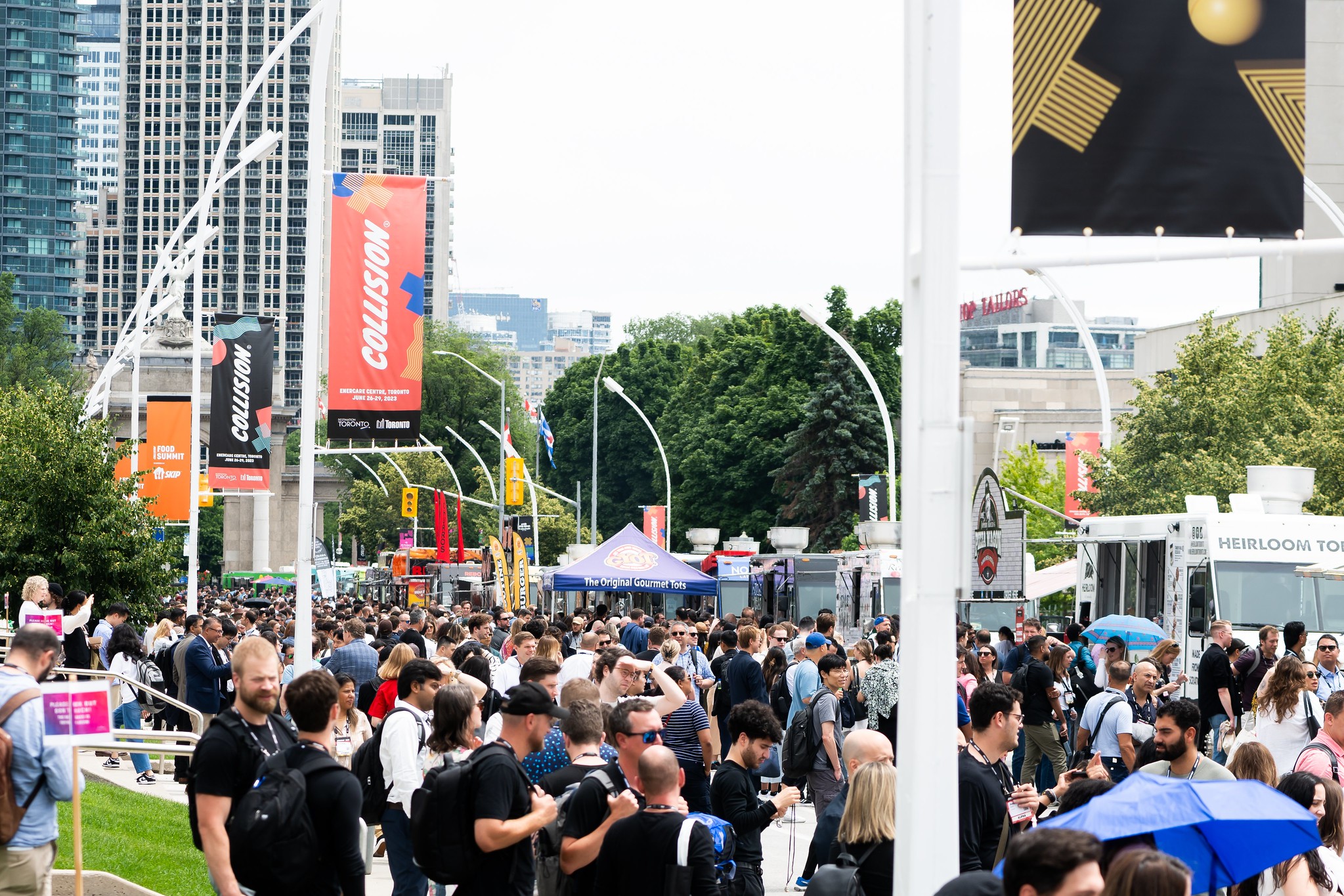
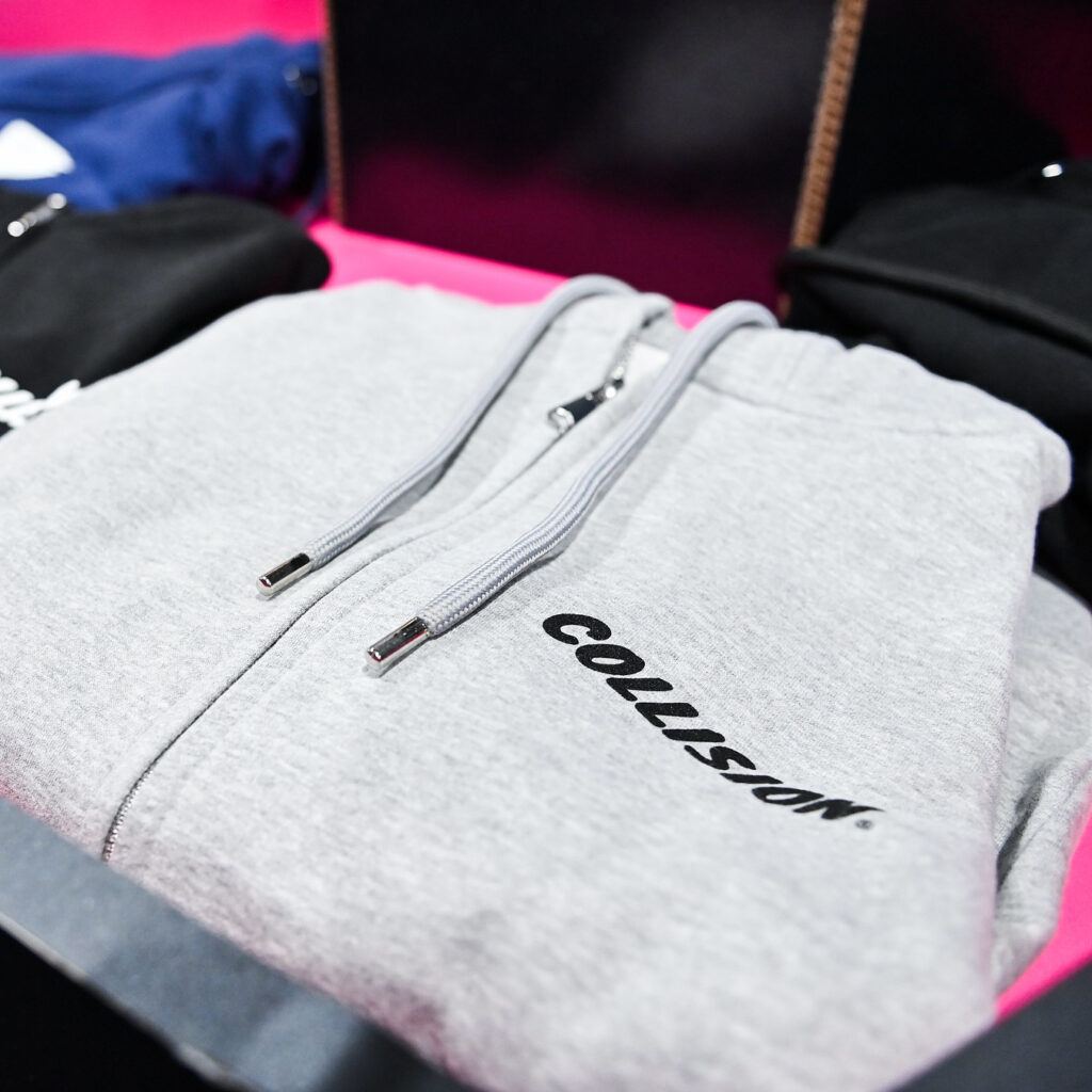
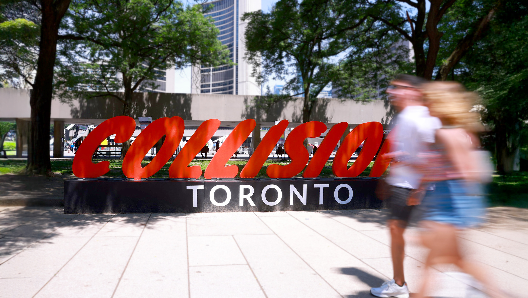
The new system wasn’t just designed for visual appeal—it was built for adaptability. Across signage, digital platforms, merchandise, and social campaigns, the identity held strong. It became a cohesive, flexible framework that amplified the energy of the event and gave it a fresh, recognizable edge.
We developed a comprehensive set of brand guidelines, a digital toolkit for everyone in the company to use, and internal communications about the evolution of the brand.
From early concepts to final rollout, this was a deep, collaborative process. It involved a lot of creative thinking, iteration, and problem-solving—but the result was a brand that didn’t just look different. It felt different. And it made an impact.